> ## Documentation Index
> Fetch the complete documentation index at: https://docs.lintkit.com/llms.txt
> Use this file to discover all available pages before exploring further.
# Smart Replace
> Find the best matching style for orphaned colors using perceptual color science
Smart Replace is available in both Free and Pro tiers. Free users can apply up to 5 fixes per session.
 ## The problem with hex matching
When you have an orphaned color like `#1487FC` and need to reconnect it to a style, a naive tool would compare hex values to find the nearest match. But hex distance does not correspond to how humans see color. Two colors with similar hex codes can look obviously different, and two colors with very different hex codes can appear nearly identical.
For example, `#808080` and `#808880` differ by only 8 in the green channel, but the shift is barely visible. Meanwhile, `#FF0000` and `#00FF00` are both "bright" but look completely different.
## How Smart Replace works
Smart Replace converts colors from RGB to the **Lab color space** and measures distance using the **Delta E 2000** (DE2000) metric. DE2000 is the industry standard for measuring how different two colors look to the human eye. It accounts for the non-linear way humans perceive hue, saturation, and lightness.
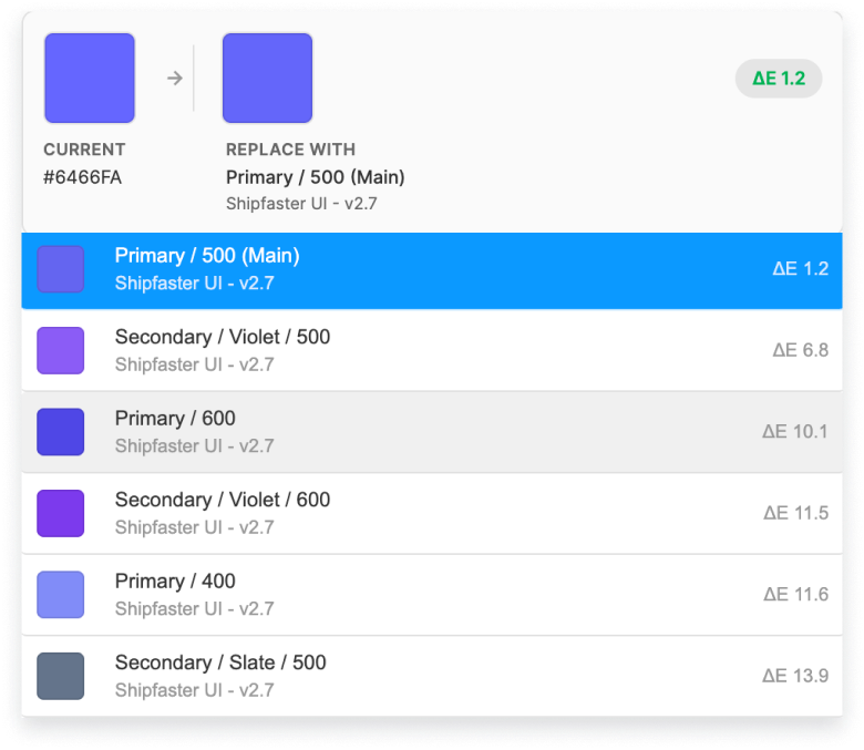
When LintKit detects an orphaned fill or stroke, Smart Replace calculates the DE2000 distance between that color and every style in your library, then suggests the closest matches.
### The three-gate algorithm
Smart Replace does not blindly suggest the lowest Delta E match. It uses a three-gate system to prevent inappropriate substitutions. A candidate style must pass all three gates to appear as a suggestion.
Reject any match where the Delta E exceeds the threshold (default: 6). If the colors are too far apart perceptually, they are not a valid match regardless of other factors.
Prevent matching neutral colors (grays, blacks, whites with chroma below 8) to saturated colors. A medium gray should never be suggested as a replacement for a vibrant blue, even if the Delta E happens to be low. When one color is neutral and the other is saturated, the match is only accepted if Delta E is below 2.5.
For saturated colors, reject any match where the hue rotates more than 35 degrees. This prevents suggesting a red style as a replacement for an orange, or a blue for a green, even when they share similar lightness and saturation.
### Confidence tiers
The style picker shows a confidence label next to each suggested match:
| Delta E | Label | What it means |
| ----------- | -------------- | ---------------------------------------------------------------------- |
| Less than 1 | Exact match | The colors are effectively identical. Safe to apply without checking. |
| 1 to 3 | Very close | Difference is imperceptible in most contexts. Safe for most use cases. |
| 3 to 10 | Similar | Visible difference when compared side by side. Review before applying. |
| 10 or above | Possible match | Clearly different colors. Only shown when no better match exists. |
### Perceptual difference reference
Use this table to understand what Delta E numbers actually look like:
| DE2000 range | Human perception |
| ------------ | ---------------------------------------------------------- |
| 0 to 1 | Imperceptible. No one can tell these apart. |
| 1 to 3 | Noticeable to a trained eye. Most people would not notice. |
| 3 to 6 | Obvious when the two colors are placed side by side. |
| 6 to 10 | Clearly different colors. No one would confuse them. |
| 10+ | Totally different colors. |
## Adjusting the tolerance
The `colorTolerance` config key controls the Delta E threshold for Gate 1. The default is 5.
* **Lower the value** (for example, 3) to get fewer but more accurate suggestions. Use this when your design system has many similar colors and you need precise matching.
* **Raise the value** (for example, 8) to get more suggestions, including looser matches. Use this during exploratory cleanup when you want to see all potential matches.
You can change this value in your [configuration](/configuration).
## When Smart Replace helps
You renamed or reorganized styles and need to reconnect orphaned layers to their closest match. Smart Replace finds the right style even when the name changed, because it matches on visual similarity rather than naming conventions.
A file accumulated colors from multiple contributors. One person used `#1488FD` and another used `#1487FC`. Smart Replace identifies these as effectively the same color and suggests the canonical style for both.
Your primary blue shifted from `#1288FD` to `#1289FF`. Smart Replace finds all near-matches across the file so you can reconnect them to the updated style.
## When to match manually
Smart Replace is not the right tool for every situation:
* **Intentionally similar colors**: If your system has both `gray-100` (#F5F5F5) and `gray-200` (#EEEEEE), Smart Replace might suggest either. You will need to pick the correct one based on semantic intent.
* **Colors that serve different purposes**: A `text/secondary` and `border/default` might be the same hex value but should not be consolidated. Review the style names, not just the color swatches.
* **Opacity-dependent colors**: Colors with different opacity values may look similar on a white background but different on other backgrounds. Smart Replace compares the raw color values, not the composited result.
## The problem with hex matching
When you have an orphaned color like `#1487FC` and need to reconnect it to a style, a naive tool would compare hex values to find the nearest match. But hex distance does not correspond to how humans see color. Two colors with similar hex codes can look obviously different, and two colors with very different hex codes can appear nearly identical.
For example, `#808080` and `#808880` differ by only 8 in the green channel, but the shift is barely visible. Meanwhile, `#FF0000` and `#00FF00` are both "bright" but look completely different.
## How Smart Replace works
Smart Replace converts colors from RGB to the **Lab color space** and measures distance using the **Delta E 2000** (DE2000) metric. DE2000 is the industry standard for measuring how different two colors look to the human eye. It accounts for the non-linear way humans perceive hue, saturation, and lightness.
When LintKit detects an orphaned fill or stroke, Smart Replace calculates the DE2000 distance between that color and every style in your library, then suggests the closest matches.
### The three-gate algorithm
Smart Replace does not blindly suggest the lowest Delta E match. It uses a three-gate system to prevent inappropriate substitutions. A candidate style must pass all three gates to appear as a suggestion.
Reject any match where the Delta E exceeds the threshold (default: 6). If the colors are too far apart perceptually, they are not a valid match regardless of other factors.
Prevent matching neutral colors (grays, blacks, whites with chroma below 8) to saturated colors. A medium gray should never be suggested as a replacement for a vibrant blue, even if the Delta E happens to be low. When one color is neutral and the other is saturated, the match is only accepted if Delta E is below 2.5.
For saturated colors, reject any match where the hue rotates more than 35 degrees. This prevents suggesting a red style as a replacement for an orange, or a blue for a green, even when they share similar lightness and saturation.
### Confidence tiers
The style picker shows a confidence label next to each suggested match:
| Delta E | Label | What it means |
| ----------- | -------------- | ---------------------------------------------------------------------- |
| Less than 1 | Exact match | The colors are effectively identical. Safe to apply without checking. |
| 1 to 3 | Very close | Difference is imperceptible in most contexts. Safe for most use cases. |
| 3 to 10 | Similar | Visible difference when compared side by side. Review before applying. |
| 10 or above | Possible match | Clearly different colors. Only shown when no better match exists. |
### Perceptual difference reference
Use this table to understand what Delta E numbers actually look like:
| DE2000 range | Human perception |
| ------------ | ---------------------------------------------------------- |
| 0 to 1 | Imperceptible. No one can tell these apart. |
| 1 to 3 | Noticeable to a trained eye. Most people would not notice. |
| 3 to 6 | Obvious when the two colors are placed side by side. |
| 6 to 10 | Clearly different colors. No one would confuse them. |
| 10+ | Totally different colors. |
## Adjusting the tolerance
The `colorTolerance` config key controls the Delta E threshold for Gate 1. The default is 5.
* **Lower the value** (for example, 3) to get fewer but more accurate suggestions. Use this when your design system has many similar colors and you need precise matching.
* **Raise the value** (for example, 8) to get more suggestions, including looser matches. Use this during exploratory cleanup when you want to see all potential matches.
You can change this value in your [configuration](/configuration).
## When Smart Replace helps
You renamed or reorganized styles and need to reconnect orphaned layers to their closest match. Smart Replace finds the right style even when the name changed, because it matches on visual similarity rather than naming conventions.
A file accumulated colors from multiple contributors. One person used `#1488FD` and another used `#1487FC`. Smart Replace identifies these as effectively the same color and suggests the canonical style for both.
Your primary blue shifted from `#1288FD` to `#1289FF`. Smart Replace finds all near-matches across the file so you can reconnect them to the updated style.
## When to match manually
Smart Replace is not the right tool for every situation:
* **Intentionally similar colors**: If your system has both `gray-100` (#F5F5F5) and `gray-200` (#EEEEEE), Smart Replace might suggest either. You will need to pick the correct one based on semantic intent.
* **Colors that serve different purposes**: A `text/secondary` and `border/default` might be the same hex value but should not be consolidated. Review the style names, not just the color swatches.
* **Opacity-dependent colors**: Colors with different opacity values may look similar on a white background but different on other backgrounds. Smart Replace compares the raw color values, not the composited result.