> ## Documentation Index
> Fetch the complete documentation index at: https://docs.lintkit.com/llms.txt
> Use this file to discover all available pages before exploring further.
# Compact view
> A responsive layout that adapts LintKit to narrow plugin windows
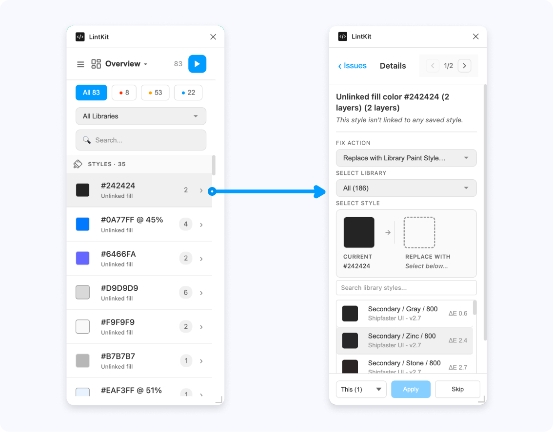
LintKit automatically switches to a mobile-style **compact view** when you resize the plugin window below a certain width. Every feature — scanning, fixing, settings, Find & Replace — works the same way. The layout just adapts to fit the space.
 ## How it activates
The layout switches based on the plugin window width:
| Window width | Layout |
| -------------- | ------------------------------------------------------------------------------ |
| 680px or wider | **Full layout** — sidebar navigation, results list, and inspector side by side |
| 500–679px | **Compact layout** — sidebar collapses to icons only |
| Below 500px | **Minimal layout** — single-column with slide-in panels |
A 20px buffer (hysteresis) prevents flickering when you resize near a boundary. For example, minimal mode activates below 500px but requires 520px to exit. This means the layout won't rapidly toggle if you're dragging the resize handle near the threshold.
Drag the resize handle in the bottom-right corner of the plugin window to adjust the width. The layout transitions smoothly between modes.
## Minimal layout
When the window is narrower than 500px, LintKit switches to a fully redesigned single-column interface.
### Navigation
The sidebar disappears entirely. Two navigation options replace it:
* **Title dropdown** — tap the category name in the header to open a dropdown showing all categories with their icons. Select one to switch.
* **Hamburger menu** — tap the menu icon to open a slide-in drawer from the left (260px wide) showing all navigation items. Settings is pinned to the bottom.
### Results list
The results list takes the full width of the plugin. It includes:
* **Severity filter pills** — tap "All", errors, warnings, or info to filter
* **Sub-tab pills** — scrollable horizontal tabs for categories that have sub-tabs (Fills, Strokes, Text, Effects, etc.)
* **Search bar** — filter findings by text
* **Run button** — a compact play button that opens a menu to scan the page or current selection
### Inspector panel
Tapping a finding in the list slides the inspector in from the right, pushing the list off-screen to the left. The inspector shows:
* A **back button** to return to the list
* **Instance navigation** — previous/next arrows with a counter ("3 of 12") to step through affected nodes
* The **full fix UI** — the same fix widgets used in the wide layout (color pickers, style selectors, contrast tools, spacing previews)
* An **action bar** at the bottom with scope selector ("This" / "All"), Apply, and Skip buttons
If you have a finding selected in wide mode and then resize the window to narrow, the inspector opens immediately on that finding instead of showing the list.
### Library mode in compact view
If library mode is active and no scan has run yet, the minimal layout shows a centered card with:
* Your library name and asset counts
* A **Run Audit** button
After scanning, the overview category shows a flat grouped list of findings organized by category (styles, values, components, structure, naming, accessibility) with sticky section headers.
## What's different in compact view
Most features work identically. These are the differences:
| Feature | Full layout | Compact view |
| ------------------- | --------------------------------- | ------------------------------------------ |
| Results + inspector | Side by side | Slide between them (one visible at a time) |
| Navigation | Persistent sidebar | Hamburger drawer or title dropdown |
| Dashboard | Full dashboard component | Grouped list of findings by category |
| Staleness banner | "N new nodes since last scan" bar | Not shown |
| Sub-navigation | Tab bar below header | Inline scrollable pills |
| Bulk select | Checkboxes on each result row | Not available |
### Features that are identical
* All fix widgets (color pickers, style selectors, naming tools, contrast inspector, spacing previews)
* Find & Replace panel (receives a `narrowMode` flag but the same component)
* Settings panel (exact same component)
* Severity filtering and search
* Fix application and undo behavior
* Instance navigation within findings
* Library discovery and token integration
## When to use compact view
Compact view is useful when you want to:
* **Keep LintKit open while working** — dock it to the side of your canvas without giving up too much screen space
* **Quick-fix on the go** — scan, find an issue, fix it, go back to the list
* **Work on smaller displays** — laptops or secondary monitors where horizontal space is limited
The full fix capabilities are always available regardless of window size, so there's no need to resize wider just to apply a fix.
## How it activates
The layout switches based on the plugin window width:
| Window width | Layout |
| -------------- | ------------------------------------------------------------------------------ |
| 680px or wider | **Full layout** — sidebar navigation, results list, and inspector side by side |
| 500–679px | **Compact layout** — sidebar collapses to icons only |
| Below 500px | **Minimal layout** — single-column with slide-in panels |
A 20px buffer (hysteresis) prevents flickering when you resize near a boundary. For example, minimal mode activates below 500px but requires 520px to exit. This means the layout won't rapidly toggle if you're dragging the resize handle near the threshold.
Drag the resize handle in the bottom-right corner of the plugin window to adjust the width. The layout transitions smoothly between modes.
## Minimal layout
When the window is narrower than 500px, LintKit switches to a fully redesigned single-column interface.
### Navigation
The sidebar disappears entirely. Two navigation options replace it:
* **Title dropdown** — tap the category name in the header to open a dropdown showing all categories with their icons. Select one to switch.
* **Hamburger menu** — tap the menu icon to open a slide-in drawer from the left (260px wide) showing all navigation items. Settings is pinned to the bottom.
### Results list
The results list takes the full width of the plugin. It includes:
* **Severity filter pills** — tap "All", errors, warnings, or info to filter
* **Sub-tab pills** — scrollable horizontal tabs for categories that have sub-tabs (Fills, Strokes, Text, Effects, etc.)
* **Search bar** — filter findings by text
* **Run button** — a compact play button that opens a menu to scan the page or current selection
### Inspector panel
Tapping a finding in the list slides the inspector in from the right, pushing the list off-screen to the left. The inspector shows:
* A **back button** to return to the list
* **Instance navigation** — previous/next arrows with a counter ("3 of 12") to step through affected nodes
* The **full fix UI** — the same fix widgets used in the wide layout (color pickers, style selectors, contrast tools, spacing previews)
* An **action bar** at the bottom with scope selector ("This" / "All"), Apply, and Skip buttons
If you have a finding selected in wide mode and then resize the window to narrow, the inspector opens immediately on that finding instead of showing the list.
### Library mode in compact view
If library mode is active and no scan has run yet, the minimal layout shows a centered card with:
* Your library name and asset counts
* A **Run Audit** button
After scanning, the overview category shows a flat grouped list of findings organized by category (styles, values, components, structure, naming, accessibility) with sticky section headers.
## What's different in compact view
Most features work identically. These are the differences:
| Feature | Full layout | Compact view |
| ------------------- | --------------------------------- | ------------------------------------------ |
| Results + inspector | Side by side | Slide between them (one visible at a time) |
| Navigation | Persistent sidebar | Hamburger drawer or title dropdown |
| Dashboard | Full dashboard component | Grouped list of findings by category |
| Staleness banner | "N new nodes since last scan" bar | Not shown |
| Sub-navigation | Tab bar below header | Inline scrollable pills |
| Bulk select | Checkboxes on each result row | Not available |
### Features that are identical
* All fix widgets (color pickers, style selectors, naming tools, contrast inspector, spacing previews)
* Find & Replace panel (receives a `narrowMode` flag but the same component)
* Settings panel (exact same component)
* Severity filtering and search
* Fix application and undo behavior
* Instance navigation within findings
* Library discovery and token integration
## When to use compact view
Compact view is useful when you want to:
* **Keep LintKit open while working** — dock it to the side of your canvas without giving up too much screen space
* **Quick-fix on the go** — scan, find an issue, fix it, go back to the list
* **Work on smaller displays** — laptops or secondary monitors where horizontal space is limited
The full fix capabilities are always available regardless of window size, so there's no need to resize wider just to apply a fix.