> ## Documentation Index
> Fetch the complete documentation index at: https://docs.lintkit.com/llms.txt
> Use this file to discover all available pages before exploring further.
# Configuration
> Set up LintKit to match your design system's rules and conventions
LintKit works out of the box with sensible defaults, but it's most useful when configured to match your team's design system. Open the **Settings** panel inside the plugin to customize rules, thresholds, and scanning behavior.
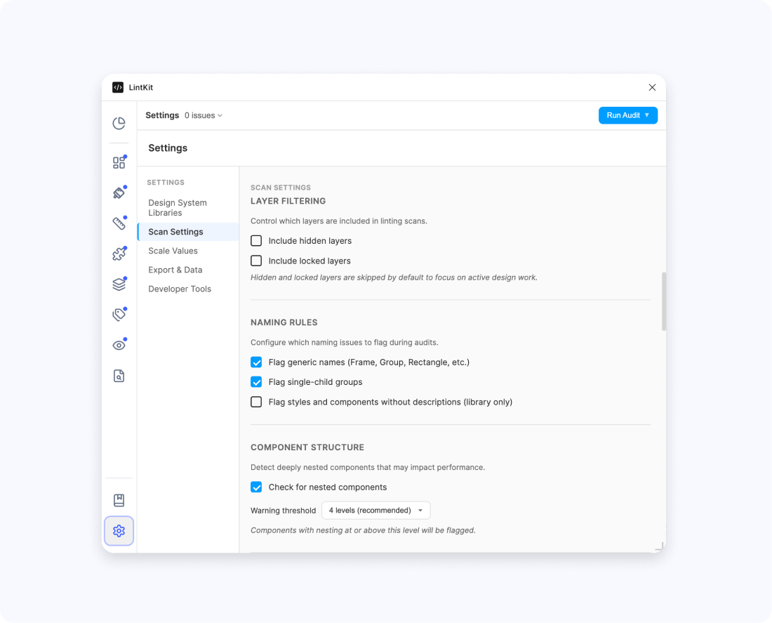 Your settings persist per user across sessions — each person who opens the plugin has their own configuration.
## Rule toggles
Most rules can be toggled individually from the **Settings** panel. When a rule is off, LintKit skips it entirely during scanning.
**Broken Variables** always runs and cannot be disabled — broken variable references are always worth catching.
### Rules that are off by default
Five rules ship disabled because they need your input before they're useful:
| Rule | Why it's off | What to configure first |
| -------------------- | --------------------------- | ------------------------------------------------ |
| Spacing Scale | Needs your spacing values | Set `allowedSpacing` or `baseSpacing` |
| Corner Radii | Needs your radius values | Review `allowedRadii` defaults or enter your own |
| Grid Alignment | Needs grid configuration | Set up column grid breakpoints |
| Duplicate Styles | Can be noisy on large files | Review `duplicateStyles.colorThreshold` |
| Missing Descriptions | Library-only, opt-in | Only useful in library files |
Start by enabling **Spacing Scale** and **Corner Radii** — these catch the most common design system violations once configured.
***
## Spacing
Spacing settings control how LintKit checks padding, gaps, line heights, and element dimensions against your design system's spacing scale.
### Allowed spacing values
* **Config key:** `allowedSpacing`
* **Default:** empty (uses multiples of `baseSpacing`)
Enter the exact spacing values your design system allows. For example, if your system uses a 4px scale: `[0, 4, 8, 12, 16, 20, 24, 32, 40, 48, 64]`.
When this list is empty, LintKit generates values from `baseSpacing` instead.
### Base spacing unit
* **Config key:** `baseSpacing`
* **Default:** `8`
The base unit for generating allowed spacing values when `allowedSpacing` is empty. If your system uses a 4px grid, set this to `4`. If you use an 8px grid, the default works.
If your spacing scale isn't a simple multiple (for example, you allow `[0, 2, 4, 8, 12, 16, 24, 32, 48, 64]`), enter the values in `allowedSpacing` directly rather than relying on `baseSpacing`.
### Spacing tolerance
* **Config key:** `spacingTolerance`
* **Default:** `0` (exact match required)
How much a value can deviate from your scale and still be considered valid, in pixels. Set this to `1` if you want to allow values within 1px of your scale (for example, 7px would pass an 8px scale). Keep at `0` for strict enforcement.
### Spacing sub-checks
LintKit checks spacing in four areas, each independently toggleable:
| Sub-check | Config key | Default | When to use |
| ----------- | -------------------------- | ------- | ----------------------------------------------------------------------------------------------------------------------------------------------------------------------------------- |
| Auto-layout | `spacingChecks.autolayout` | On | Keep on. Checks padding, item spacing, and counter-axis spacing in auto-layout frames. These are high-confidence findings with one-click fixes. |
| Line height | `spacingChecks.lineHeight` | On | Keep on if your text styles use fixed pixel line heights. Turn off if you use percentage-based or auto line heights. |
| Manual gaps | `spacingChecks.manualGaps` | On | Checks gaps between siblings in non-auto-layout frames. Useful for catching freeform layouts that should use your spacing scale. Findings are low-confidence (manual fix required). |
| Dimensions | `spacingChecks.dimensions` | Off | Checks width and height values. Turn on if your system enforces fixed sizing (e.g., icon containers must be 24px or 32px). Can be noisy — start with it off and enable selectively. |
### Line heights
* **Config key:** `allowedLineHeights`
* **Default:** `'inherit'` (uses the same scale as `allowedSpacing`)
Set a separate scale if your line heights don't follow your spacing scale. For example, your spacing might use `[0, 4, 8, 16, 24, 32]` but your line heights might be `[16, 20, 24, 28, 32, 40, 48]`.
When set to `'inherit'`, LintKit uses your `allowedSpacing` values (or multiples of `baseSpacing`) for line height checks too.
Only pixel-based line heights are checked. Percentage and auto line heights are always valid.
### Max dimension to check
* **Config key:** `maxDimensionToCheck`
* **Default:** `200`
Elements larger than this value (in pixels) are excluded from dimension checking. This prevents false positives on large containers, hero sections, and full-width frames.
Lower this value if you only want to check small, fixed-size elements like icon containers and buttons. Raise it if your system also enforces dimensions on larger elements.
***
## Corner radii
* **Config key:** `allowedRadii`
* **Default:** `[0, 4, 8, 12, 16, 24, 32]`
Define which corner radius values are valid. Any radius not in this list triggers a finding, and LintKit suggests the nearest allowed value as a one-click fix.
**Zero is always valid** — you don't need to include `0` in your list, but it's there by default.
If your design system uses `2px` for inputs, `4px` for cards, `8px` for modals, and `9999px` for pills:
Set `allowedRadii` to `[0, 2, 4, 8, 9999]`.
A component with a 6px radius would be flagged, with a suggestion to snap to either 4px or 8px (whichever is closest).
Elements with mixed radii (different values on each corner) are skipped. LintKit cannot determine the intended value when corners differ.
***
## Stroke weights
* **Config key:** `allowedStrokes`
* **Default:** `[1, 2, 3, 4]`
Define which stroke weight values are valid. Unlike most rules, the Stroke Weight rule reports every distinct weight in your file — not just off-scale ones — so you can see the full picture and decide which weights to standardize.
For each off-scale weight, LintKit suggests replacement values from your allowed list.
***
## Color tolerance
Two separate color tolerance settings control different features. Both use Delta E 2000, a perceptual color distance metric where lower values mean more similar colors.
### Style matching tolerance
* **Config key:** `colorTolerance`
* **Default:** `5`
Used by the Orphaned Fills and Orphaned Strokes rules to suggest the nearest matching style when a fill or stroke isn't linked to one. A tolerance of `5` means LintKit will suggest styles that are perceptually close but not identical.
**When to adjust:**
* **Lower to 2–3** if you're getting suggestions for styles that are too different from the actual color
* **Raise to 7–8** if you want broader suggestions (useful during a migration where colors may have drifted)
### Duplicate style tolerance
* **Config key:** `duplicateStyles.colorThreshold`
* **Default:** `2`
Used by the Duplicate Styles rule to flag paint styles that are nearly identical. A tighter tolerance of `2` means only very similar styles are flagged as duplicates.
**When to adjust:**
* **Lower to 1** if you want only near-exact duplicates flagged
* **Raise to 3–4** if you want to catch styles that have drifted apart over time
These are different settings for different purposes. Style matching uses a wider tolerance (`5`) to help you find possible matches. Duplicate detection uses a tighter tolerance (`2`) to avoid false positives when flagging styles to merge.
### Duplicate styles sub-toggles
Control which style types are checked for duplicates:
| Toggle | Config key | Default | What it checks |
| ------------- | ----------------------------------- | ------- | ------------------------------------------------------------------------------------------- |
| Paint styles | `duplicateStyles.checkPaintStyles` | On | Near-identical fill and stroke styles (uses Delta E color comparison) |
| Text styles | `duplicateStyles.checkTextStyles` | On | Exact match on font family, size, weight, letter spacing, line height, case, and decoration |
| Effect styles | `duplicateStyles.checkEffectStyles` | On | Exact match on effect type, offset, radius, spread, color, and opacity |
Duplicate detection only compares styles within the same semantic category. For example, `text/primary` is only compared against other `text/*` styles, not `icon/*` styles — even if they share the same color.
***
## Accessibility
### WCAG level
* **Config key:** `accessibility.wcagLevel`
* **Default:** `'AA'`
* **Options:** `'AA'` or `'AAA'`
Controls which WCAG contrast standard LintKit checks against:
| Level | Normal text | Large text |
| ------------------ | ----------- | ---------- |
| **AA** (default) | 4.5:1 | 3:1 |
| **AAA** (stricter) | 7:1 | 4.5:1 |
**Large text** is 18pt or larger at regular weight, or 14pt or larger at bold weight.
Most teams use AA. Switch to AAA if your organization requires enhanced accessibility compliance or if you're building for audiences with visual impairments.
### Assumed background color
* **Config key:** `accessibility.assumedBgColor`
* **Default:** `'#FFFFFF'`
When LintKit cannot detect a background behind a text layer (no sibling fills, no parent frame fills), it falls back to this color for contrast calculations.
**When to change:** If your designs primarily use a dark background, set this to your dark background color (e.g., `'#1A1A1A'`). This prevents false positives where LintKit assumes white and flags dark-on-dark text as passing.
***
## Layer filtering
| Filter | Config key | Default | When to enable |
| --------------------- | ---------------------------------- | ------- | ------------------------------------------------------------------------------------------------------------------------------ |
| Include hidden layers | `layerFilters.includeHiddenLayers` | Off | Turn on to scan layers you've hidden with the eye icon. Useful for catching abandoned hidden layers that contain stale styles. |
| Include locked layers | `layerFilters.includeLockedLayers` | Off | Turn on to include locked layers in the scan. Useful if your team locks finalized sections and you still want to scan them. |
By default, hidden and locked layers are excluded entirely — LintKit doesn't traverse into them at all.
***
## Naming
### Flag generic names
* **Config key:** `naming.flagGenericNames`
* **Default:** on
Flags default Figma layer names like "Frame 1", "Rectangle 42", or "Group". These generic names make files harder to navigate and maintain.
LintKit assigns severity based on where the layer sits in the hierarchy:
| Layer position | Severity | Example |
| --------------------------------------- | -------- | ----------------------------------------- |
| Top-level frames, sections, components | Error | A top-level frame named "Frame 5" |
| Shallow frames, groups, text, instances | Warning | A button group named "Group" |
| Deep nested frames and groups | Info | A deeply nested "Rectangle" |
| Vectors, ellipses, basic shapes | Skipped | Shapes are expected to have default names |
### Custom forbidden patterns
* **Config key:** `naming.patterns`
* **Default:** none
Add your own patterns to flag layer names that don't match your conventions. LintKit also includes 28 built-in detection patterns for common problematic names like "Copy", "TODO", and "placeholder". See [cleanup rules](/rules/cleanup) for the full list.
### Convention detection
LintKit observes the naming patterns in your file. When it detects a consistent convention (at least 5 samples with 70% or more consistency), it flags names that break the convention. This works automatically — no configuration needed.
***
## Component structure
### Nesting depth thresholds
* **Warning threshold:** `componentStructure.nestingWarningThreshold`, default `4`
* **Error threshold:** `componentStructure.nestingErrorThreshold`, default `6`
Controls when deeply nested component instances trigger findings. Deep nesting can cause performance problems in Figma — each level of nesting adds to the render tree.
**When to adjust:**
* If your components are intentionally deep (e.g., complex data tables), raise the thresholds
* If you want stricter control, lower the warning threshold to `3`
A `Card` component that contains a `Header` instance, which contains an `Avatar` instance, which contains an `Icon` instance = 3 levels of nesting.
At the default threshold of 4, this would not trigger a finding. Add one more level (e.g., `Badge` inside `Icon`) and it would trigger a warning.
***
## Absolute positioning
* **Flag absolute in auto-layout:** `layout.flagAbsoluteInAutoLayout`, default on
* **Severity:** `layout.absolutePositioningSeverity`, default `warn` (options: `info`, `warn`, `error`)
Flags layers that use absolute positioning inside auto-layout frames. Absolute positioning overrides the auto-layout flow, which can cause unexpected behavior when the frame resizes.
**When to adjust:**
* Set severity to `info` if your team intentionally uses absolute positioning for overlays, badges, or floating elements inside auto-layout frames
* Set severity to `error` if absolute positioning in auto-layout is always unintentional in your workflow
* Turn the rule off entirely if your design patterns rely heavily on absolute positioning within auto-layout
***
## Library governance
* **Config key:** `approvedLibraryKeys`
* **Default:** empty (all libraries allowed)
When this list is empty, LintKit does not check which libraries your components come from — all libraries are considered approved.
When you add library keys to this list, the Unapproved Libraries rule flags any component instance that comes from a library not on your approved list. This is useful for teams that maintain an official design system and want to prevent usage of unauthorized or outdated libraries.
LintKit automatically approves libraries that share a prefix with the most-used library in your file. For example, if most of your components come from "Acme Design System", LintKit auto-approves other libraries starting with "Acme" (like "Acme Icons").
This means you usually only need to add your primary library key — related libraries are approved automatically.
***
## Ignored findings
### Default scope
* **Config key:** `ignoredConfig.defaultScope`
* **Default:** `'file'`
* **Options:** `'file'` or `'user'`
Controls who sees an ignored finding:
* **File scope:** The ignored state is shared with everyone who opens the file. When you ignore a finding, your teammates won't see it either. Use this for intentional design decisions the team has agreed on.
* **User scope:** The ignored state is personal. Only you stop seeing the finding. Use this for findings you've reviewed and decided to skip without affecting your team.
### Show ignored in results
* **Config key:** `ignoredConfig.showIgnoredInResults`
* **Default:** off
When on, ignored findings stay visible in the results list but appear dimmed. This is useful if you want to keep track of what's been intentionally suppressed without cluttering the main results.
***
## Tokens Studio auto-configuration
Connect [Tokens Studio](/integrations/tokens-studio) to auto-configure rules from your design token definitions instead of manually entering values.
### Enable
* **Config key:** `tokensStudio.enabled`
* **Default:** off
Turn this on after connecting a token source (Figma shared plugin data, Tokens Studio API, or GitHub).
### Enforcement mode
* **Config key:** `tokensStudio.enforcementMode`
* **Default:** `'advisory'`
* **Options:** `'advisory'` or `'strict'`
Controls how LintKit uses token values during scanning:
* **Advisory:** Token values are merged with your manual configuration. Findings still appear but include token metadata so you can see which token matches. Use this to start with — it shows you the full picture without suppressing anything.
* **Strict:** If a design value matches a token definition, the finding is suppressed entirely. For example, an orphaned fill that happens to match a color token is not flagged. Use this when your team trusts the token system and only wants to see values that fall outside it.
### Token type toggles
Control which token types LintKit enforces:
| Toggle | Config key | Default | Affected rules |
| ------- | ----------------------------- | ------- | -------------------------------- |
| Colors | `tokensStudio.enforceColors` | On | Orphaned Fills, Orphaned Strokes |
| Spacing | `tokensStudio.enforceSpacing` | On | Spacing Scale |
| Radii | `tokensStudio.enforceRadii` | On | Corner Radii |
### Auto-sync
* **Config key:** `tokensStudio.autoSync`
* **Default:** on
When enabled, LintKit re-fetches tokens automatically each time the plugin opens. Turn this off if you prefer to sync manually by clicking **Sync** in the integrations panel.
Token values are cached for 30 seconds after fetching. Click **Sync** to force a refresh at any time.
See [Tokens Studio integration](/integrations/tokens-studio) for full setup instructions.
***
## Example configurations
* `baseSpacing`: `8`
* `allowedSpacing`: `[0, 4, 8, 16, 24, 32, 48, 64]` (include 4 for half-spacing)
* `spacingTolerance`: `0` (exact match)
* `spacingChecks.autolayout`: on
* `spacingChecks.lineHeight`: on
* `spacingChecks.dimensions`: off (enable later when ready)
* Enable the Spacing Scale rule in **Settings**
If you're working in a library file that publishes components and styles:
* Enable **Missing Descriptions** (off by default)
* Enable **Duplicate Styles** to find consolidation opportunities
* Set `ignoredConfig.defaultScope` to `'file'` so ignored findings are shared with co-editors
* Variable Completeness, Unused Styles, and Hidden Components run automatically in library files
* `accessibility.wcagLevel`: `'AAA'`
* `accessibility.assumedBgColor`: set to your actual default background color
* Keep Contrast rule enabled (on by default)
* Consider enabling `spacingChecks.dimensions` to catch non-standard touch target sizes
During early design exploration when consistency is less important:
* `spacingTolerance`: `2` (allow 2px deviation)
* `layout.absolutePositioningSeverity`: `'info'` (downgrade from warning)
* Turn off Spacing Scale and Corner Radii until the design stabilizes
* Keep Broken Variables and Contrast on — these catch real problems regardless of design phase
Your settings persist per user across sessions — each person who opens the plugin has their own configuration.
## Rule toggles
Most rules can be toggled individually from the **Settings** panel. When a rule is off, LintKit skips it entirely during scanning.
**Broken Variables** always runs and cannot be disabled — broken variable references are always worth catching.
### Rules that are off by default
Five rules ship disabled because they need your input before they're useful:
| Rule | Why it's off | What to configure first |
| -------------------- | --------------------------- | ------------------------------------------------ |
| Spacing Scale | Needs your spacing values | Set `allowedSpacing` or `baseSpacing` |
| Corner Radii | Needs your radius values | Review `allowedRadii` defaults or enter your own |
| Grid Alignment | Needs grid configuration | Set up column grid breakpoints |
| Duplicate Styles | Can be noisy on large files | Review `duplicateStyles.colorThreshold` |
| Missing Descriptions | Library-only, opt-in | Only useful in library files |
Start by enabling **Spacing Scale** and **Corner Radii** — these catch the most common design system violations once configured.
***
## Spacing
Spacing settings control how LintKit checks padding, gaps, line heights, and element dimensions against your design system's spacing scale.
### Allowed spacing values
* **Config key:** `allowedSpacing`
* **Default:** empty (uses multiples of `baseSpacing`)
Enter the exact spacing values your design system allows. For example, if your system uses a 4px scale: `[0, 4, 8, 12, 16, 20, 24, 32, 40, 48, 64]`.
When this list is empty, LintKit generates values from `baseSpacing` instead.
### Base spacing unit
* **Config key:** `baseSpacing`
* **Default:** `8`
The base unit for generating allowed spacing values when `allowedSpacing` is empty. If your system uses a 4px grid, set this to `4`. If you use an 8px grid, the default works.
If your spacing scale isn't a simple multiple (for example, you allow `[0, 2, 4, 8, 12, 16, 24, 32, 48, 64]`), enter the values in `allowedSpacing` directly rather than relying on `baseSpacing`.
### Spacing tolerance
* **Config key:** `spacingTolerance`
* **Default:** `0` (exact match required)
How much a value can deviate from your scale and still be considered valid, in pixels. Set this to `1` if you want to allow values within 1px of your scale (for example, 7px would pass an 8px scale). Keep at `0` for strict enforcement.
### Spacing sub-checks
LintKit checks spacing in four areas, each independently toggleable:
| Sub-check | Config key | Default | When to use |
| ----------- | -------------------------- | ------- | ----------------------------------------------------------------------------------------------------------------------------------------------------------------------------------- |
| Auto-layout | `spacingChecks.autolayout` | On | Keep on. Checks padding, item spacing, and counter-axis spacing in auto-layout frames. These are high-confidence findings with one-click fixes. |
| Line height | `spacingChecks.lineHeight` | On | Keep on if your text styles use fixed pixel line heights. Turn off if you use percentage-based or auto line heights. |
| Manual gaps | `spacingChecks.manualGaps` | On | Checks gaps between siblings in non-auto-layout frames. Useful for catching freeform layouts that should use your spacing scale. Findings are low-confidence (manual fix required). |
| Dimensions | `spacingChecks.dimensions` | Off | Checks width and height values. Turn on if your system enforces fixed sizing (e.g., icon containers must be 24px or 32px). Can be noisy — start with it off and enable selectively. |
### Line heights
* **Config key:** `allowedLineHeights`
* **Default:** `'inherit'` (uses the same scale as `allowedSpacing`)
Set a separate scale if your line heights don't follow your spacing scale. For example, your spacing might use `[0, 4, 8, 16, 24, 32]` but your line heights might be `[16, 20, 24, 28, 32, 40, 48]`.
When set to `'inherit'`, LintKit uses your `allowedSpacing` values (or multiples of `baseSpacing`) for line height checks too.
Only pixel-based line heights are checked. Percentage and auto line heights are always valid.
### Max dimension to check
* **Config key:** `maxDimensionToCheck`
* **Default:** `200`
Elements larger than this value (in pixels) are excluded from dimension checking. This prevents false positives on large containers, hero sections, and full-width frames.
Lower this value if you only want to check small, fixed-size elements like icon containers and buttons. Raise it if your system also enforces dimensions on larger elements.
***
## Corner radii
* **Config key:** `allowedRadii`
* **Default:** `[0, 4, 8, 12, 16, 24, 32]`
Define which corner radius values are valid. Any radius not in this list triggers a finding, and LintKit suggests the nearest allowed value as a one-click fix.
**Zero is always valid** — you don't need to include `0` in your list, but it's there by default.
If your design system uses `2px` for inputs, `4px` for cards, `8px` for modals, and `9999px` for pills:
Set `allowedRadii` to `[0, 2, 4, 8, 9999]`.
A component with a 6px radius would be flagged, with a suggestion to snap to either 4px or 8px (whichever is closest).
Elements with mixed radii (different values on each corner) are skipped. LintKit cannot determine the intended value when corners differ.
***
## Stroke weights
* **Config key:** `allowedStrokes`
* **Default:** `[1, 2, 3, 4]`
Define which stroke weight values are valid. Unlike most rules, the Stroke Weight rule reports every distinct weight in your file — not just off-scale ones — so you can see the full picture and decide which weights to standardize.
For each off-scale weight, LintKit suggests replacement values from your allowed list.
***
## Color tolerance
Two separate color tolerance settings control different features. Both use Delta E 2000, a perceptual color distance metric where lower values mean more similar colors.
### Style matching tolerance
* **Config key:** `colorTolerance`
* **Default:** `5`
Used by the Orphaned Fills and Orphaned Strokes rules to suggest the nearest matching style when a fill or stroke isn't linked to one. A tolerance of `5` means LintKit will suggest styles that are perceptually close but not identical.
**When to adjust:**
* **Lower to 2–3** if you're getting suggestions for styles that are too different from the actual color
* **Raise to 7–8** if you want broader suggestions (useful during a migration where colors may have drifted)
### Duplicate style tolerance
* **Config key:** `duplicateStyles.colorThreshold`
* **Default:** `2`
Used by the Duplicate Styles rule to flag paint styles that are nearly identical. A tighter tolerance of `2` means only very similar styles are flagged as duplicates.
**When to adjust:**
* **Lower to 1** if you want only near-exact duplicates flagged
* **Raise to 3–4** if you want to catch styles that have drifted apart over time
These are different settings for different purposes. Style matching uses a wider tolerance (`5`) to help you find possible matches. Duplicate detection uses a tighter tolerance (`2`) to avoid false positives when flagging styles to merge.
### Duplicate styles sub-toggles
Control which style types are checked for duplicates:
| Toggle | Config key | Default | What it checks |
| ------------- | ----------------------------------- | ------- | ------------------------------------------------------------------------------------------- |
| Paint styles | `duplicateStyles.checkPaintStyles` | On | Near-identical fill and stroke styles (uses Delta E color comparison) |
| Text styles | `duplicateStyles.checkTextStyles` | On | Exact match on font family, size, weight, letter spacing, line height, case, and decoration |
| Effect styles | `duplicateStyles.checkEffectStyles` | On | Exact match on effect type, offset, radius, spread, color, and opacity |
Duplicate detection only compares styles within the same semantic category. For example, `text/primary` is only compared against other `text/*` styles, not `icon/*` styles — even if they share the same color.
***
## Accessibility
### WCAG level
* **Config key:** `accessibility.wcagLevel`
* **Default:** `'AA'`
* **Options:** `'AA'` or `'AAA'`
Controls which WCAG contrast standard LintKit checks against:
| Level | Normal text | Large text |
| ------------------ | ----------- | ---------- |
| **AA** (default) | 4.5:1 | 3:1 |
| **AAA** (stricter) | 7:1 | 4.5:1 |
**Large text** is 18pt or larger at regular weight, or 14pt or larger at bold weight.
Most teams use AA. Switch to AAA if your organization requires enhanced accessibility compliance or if you're building for audiences with visual impairments.
### Assumed background color
* **Config key:** `accessibility.assumedBgColor`
* **Default:** `'#FFFFFF'`
When LintKit cannot detect a background behind a text layer (no sibling fills, no parent frame fills), it falls back to this color for contrast calculations.
**When to change:** If your designs primarily use a dark background, set this to your dark background color (e.g., `'#1A1A1A'`). This prevents false positives where LintKit assumes white and flags dark-on-dark text as passing.
***
## Layer filtering
| Filter | Config key | Default | When to enable |
| --------------------- | ---------------------------------- | ------- | ------------------------------------------------------------------------------------------------------------------------------ |
| Include hidden layers | `layerFilters.includeHiddenLayers` | Off | Turn on to scan layers you've hidden with the eye icon. Useful for catching abandoned hidden layers that contain stale styles. |
| Include locked layers | `layerFilters.includeLockedLayers` | Off | Turn on to include locked layers in the scan. Useful if your team locks finalized sections and you still want to scan them. |
By default, hidden and locked layers are excluded entirely — LintKit doesn't traverse into them at all.
***
## Naming
### Flag generic names
* **Config key:** `naming.flagGenericNames`
* **Default:** on
Flags default Figma layer names like "Frame 1", "Rectangle 42", or "Group". These generic names make files harder to navigate and maintain.
LintKit assigns severity based on where the layer sits in the hierarchy:
| Layer position | Severity | Example |
| --------------------------------------- | -------- | ----------------------------------------- |
| Top-level frames, sections, components | Error | A top-level frame named "Frame 5" |
| Shallow frames, groups, text, instances | Warning | A button group named "Group" |
| Deep nested frames and groups | Info | A deeply nested "Rectangle" |
| Vectors, ellipses, basic shapes | Skipped | Shapes are expected to have default names |
### Custom forbidden patterns
* **Config key:** `naming.patterns`
* **Default:** none
Add your own patterns to flag layer names that don't match your conventions. LintKit also includes 28 built-in detection patterns for common problematic names like "Copy", "TODO", and "placeholder". See [cleanup rules](/rules/cleanup) for the full list.
### Convention detection
LintKit observes the naming patterns in your file. When it detects a consistent convention (at least 5 samples with 70% or more consistency), it flags names that break the convention. This works automatically — no configuration needed.
***
## Component structure
### Nesting depth thresholds
* **Warning threshold:** `componentStructure.nestingWarningThreshold`, default `4`
* **Error threshold:** `componentStructure.nestingErrorThreshold`, default `6`
Controls when deeply nested component instances trigger findings. Deep nesting can cause performance problems in Figma — each level of nesting adds to the render tree.
**When to adjust:**
* If your components are intentionally deep (e.g., complex data tables), raise the thresholds
* If you want stricter control, lower the warning threshold to `3`
A `Card` component that contains a `Header` instance, which contains an `Avatar` instance, which contains an `Icon` instance = 3 levels of nesting.
At the default threshold of 4, this would not trigger a finding. Add one more level (e.g., `Badge` inside `Icon`) and it would trigger a warning.
***
## Absolute positioning
* **Flag absolute in auto-layout:** `layout.flagAbsoluteInAutoLayout`, default on
* **Severity:** `layout.absolutePositioningSeverity`, default `warn` (options: `info`, `warn`, `error`)
Flags layers that use absolute positioning inside auto-layout frames. Absolute positioning overrides the auto-layout flow, which can cause unexpected behavior when the frame resizes.
**When to adjust:**
* Set severity to `info` if your team intentionally uses absolute positioning for overlays, badges, or floating elements inside auto-layout frames
* Set severity to `error` if absolute positioning in auto-layout is always unintentional in your workflow
* Turn the rule off entirely if your design patterns rely heavily on absolute positioning within auto-layout
***
## Library governance
* **Config key:** `approvedLibraryKeys`
* **Default:** empty (all libraries allowed)
When this list is empty, LintKit does not check which libraries your components come from — all libraries are considered approved.
When you add library keys to this list, the Unapproved Libraries rule flags any component instance that comes from a library not on your approved list. This is useful for teams that maintain an official design system and want to prevent usage of unauthorized or outdated libraries.
LintKit automatically approves libraries that share a prefix with the most-used library in your file. For example, if most of your components come from "Acme Design System", LintKit auto-approves other libraries starting with "Acme" (like "Acme Icons").
This means you usually only need to add your primary library key — related libraries are approved automatically.
***
## Ignored findings
### Default scope
* **Config key:** `ignoredConfig.defaultScope`
* **Default:** `'file'`
* **Options:** `'file'` or `'user'`
Controls who sees an ignored finding:
* **File scope:** The ignored state is shared with everyone who opens the file. When you ignore a finding, your teammates won't see it either. Use this for intentional design decisions the team has agreed on.
* **User scope:** The ignored state is personal. Only you stop seeing the finding. Use this for findings you've reviewed and decided to skip without affecting your team.
### Show ignored in results
* **Config key:** `ignoredConfig.showIgnoredInResults`
* **Default:** off
When on, ignored findings stay visible in the results list but appear dimmed. This is useful if you want to keep track of what's been intentionally suppressed without cluttering the main results.
***
## Tokens Studio auto-configuration
Connect [Tokens Studio](/integrations/tokens-studio) to auto-configure rules from your design token definitions instead of manually entering values.
### Enable
* **Config key:** `tokensStudio.enabled`
* **Default:** off
Turn this on after connecting a token source (Figma shared plugin data, Tokens Studio API, or GitHub).
### Enforcement mode
* **Config key:** `tokensStudio.enforcementMode`
* **Default:** `'advisory'`
* **Options:** `'advisory'` or `'strict'`
Controls how LintKit uses token values during scanning:
* **Advisory:** Token values are merged with your manual configuration. Findings still appear but include token metadata so you can see which token matches. Use this to start with — it shows you the full picture without suppressing anything.
* **Strict:** If a design value matches a token definition, the finding is suppressed entirely. For example, an orphaned fill that happens to match a color token is not flagged. Use this when your team trusts the token system and only wants to see values that fall outside it.
### Token type toggles
Control which token types LintKit enforces:
| Toggle | Config key | Default | Affected rules |
| ------- | ----------------------------- | ------- | -------------------------------- |
| Colors | `tokensStudio.enforceColors` | On | Orphaned Fills, Orphaned Strokes |
| Spacing | `tokensStudio.enforceSpacing` | On | Spacing Scale |
| Radii | `tokensStudio.enforceRadii` | On | Corner Radii |
### Auto-sync
* **Config key:** `tokensStudio.autoSync`
* **Default:** on
When enabled, LintKit re-fetches tokens automatically each time the plugin opens. Turn this off if you prefer to sync manually by clicking **Sync** in the integrations panel.
Token values are cached for 30 seconds after fetching. Click **Sync** to force a refresh at any time.
See [Tokens Studio integration](/integrations/tokens-studio) for full setup instructions.
***
## Example configurations
* `baseSpacing`: `8`
* `allowedSpacing`: `[0, 4, 8, 16, 24, 32, 48, 64]` (include 4 for half-spacing)
* `spacingTolerance`: `0` (exact match)
* `spacingChecks.autolayout`: on
* `spacingChecks.lineHeight`: on
* `spacingChecks.dimensions`: off (enable later when ready)
* Enable the Spacing Scale rule in **Settings**
If you're working in a library file that publishes components and styles:
* Enable **Missing Descriptions** (off by default)
* Enable **Duplicate Styles** to find consolidation opportunities
* Set `ignoredConfig.defaultScope` to `'file'` so ignored findings are shared with co-editors
* Variable Completeness, Unused Styles, and Hidden Components run automatically in library files
* `accessibility.wcagLevel`: `'AAA'`
* `accessibility.assumedBgColor`: set to your actual default background color
* Keep Contrast rule enabled (on by default)
* Consider enabling `spacingChecks.dimensions` to catch non-standard touch target sizes
During early design exploration when consistency is less important:
* `spacingTolerance`: `2` (allow 2px deviation)
* `layout.absolutePositioningSeverity`: `'info'` (downgrade from warning)
* Turn off Spacing Scale and Corner Radii until the design stabilizes
* Keep Broken Variables and Contrast on — these catch real problems regardless of design phase